
The connection shared by all the interiors below is that they are renovations, an important subject as we aim to increase the sustainability of our buildings through reuse and adaption. This piece features one house and two apartments, any one of which would be hard to locate in the world because the stylistic choices made are decidedly international in flavour; a point I will try to reinforce by not revealing their locations. (Though I will, of course, give the designers credit, and readers will be able to reverse engineering the project's location from that.)
There are no immediate hints at the regions these designs hail from. For this reason, Minimalism is an excellent foil to our architectural criticism as it's a complex style to analyze because of this feature, and therefore its details become important to distinguishing good from bad. Taken as a group, one of the broad themes seen in the examples are that it's hard to balance the good characteristics of minimal design – the refined expression of form, the bright and open interiors, etc. – without having the interiors careen into a style that's sterile and unstimulating. One can almost feel the sharp edge everywhere.
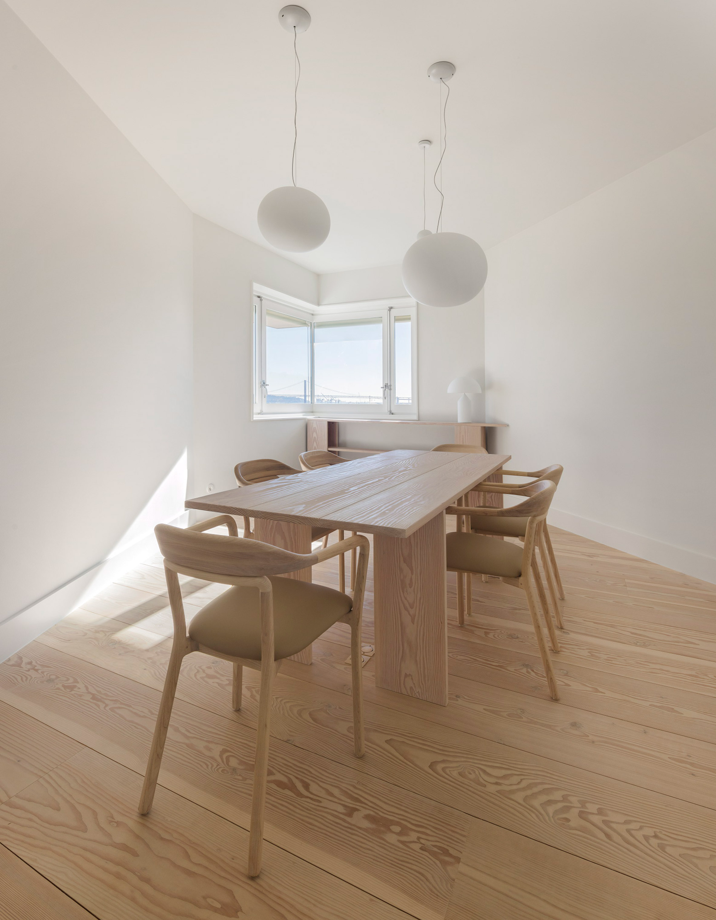
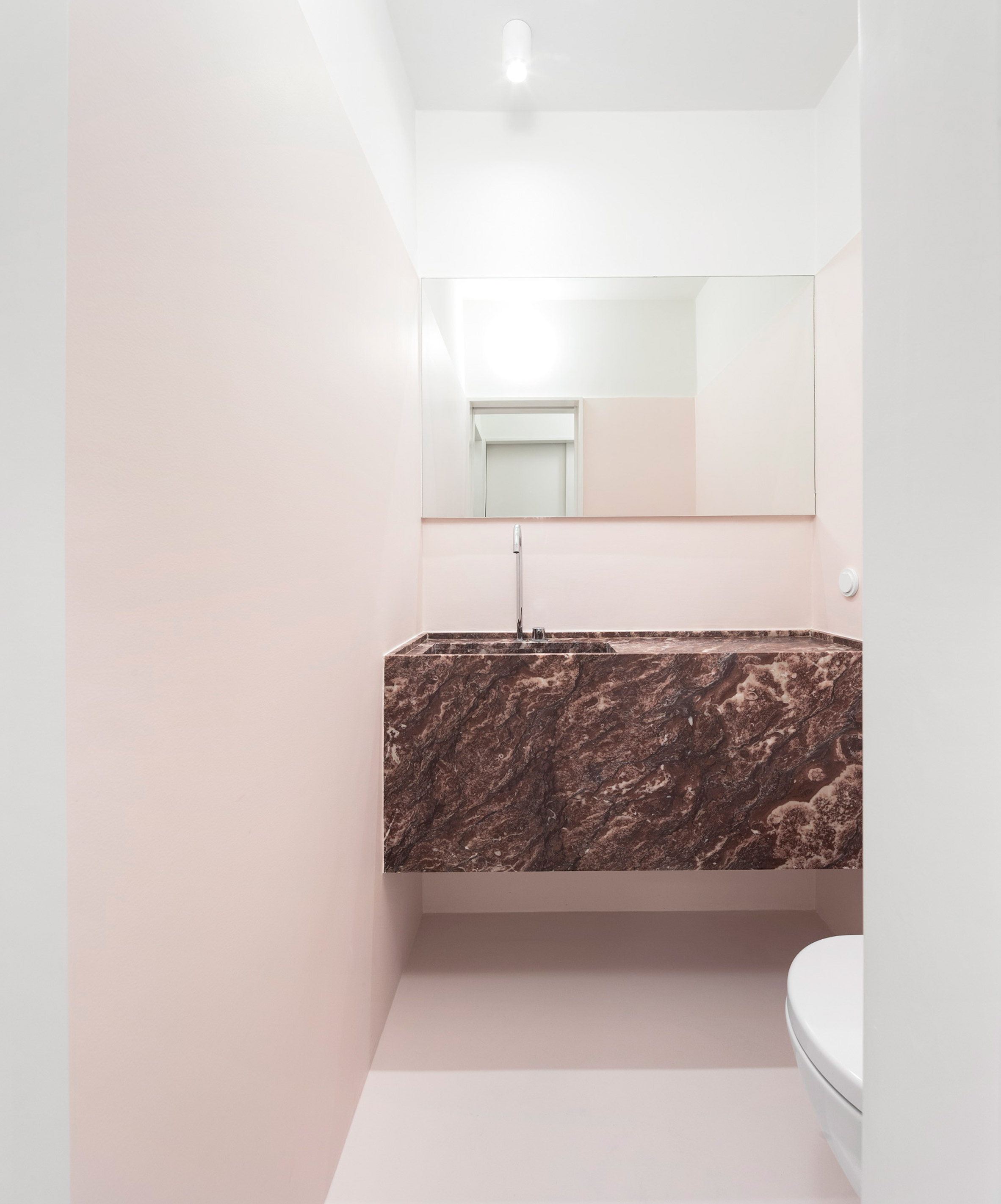
First up, designer Rita Aguiar Rodrigues was tasked with renovating a series of suites in a 19th century apartment block. These interiors are so spartan they barely looked lived in. And that's a sad characteristic because it's like a musical instrument that never gets played. The only dinner party I can imagine occurring in the dining room is silent without eye contact. The baseboards and trim are reduced to a minimal profile, with the original wide plank floorboards refinished and greatly lightened to brighten the interior. One standout feature of these apartments are the bathroom suites use of marble. Super beautiful and probably quiet pricy if they also sprung for the fancy nickel-plated Moen faucets.
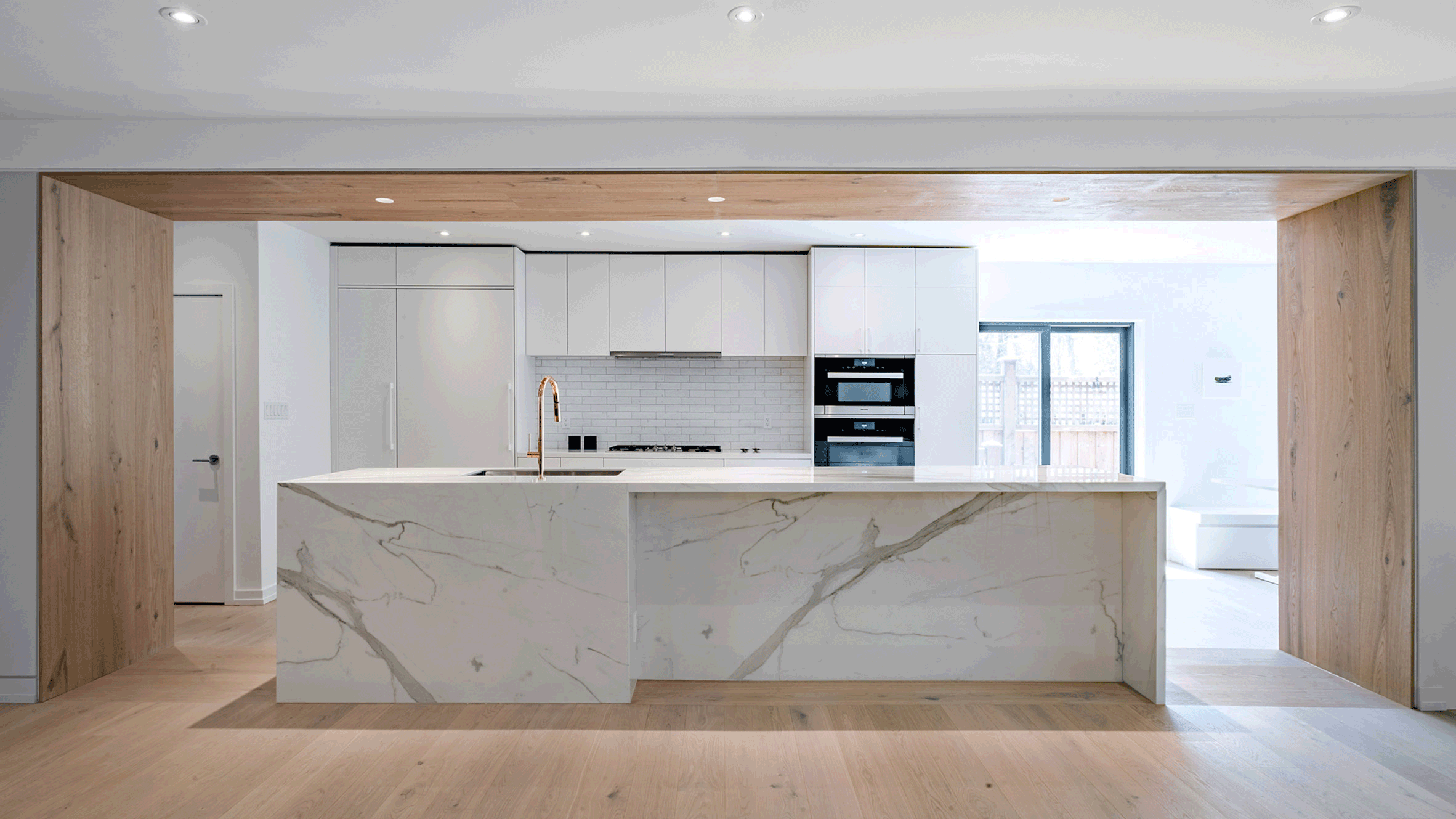
One huge home run for this house is the kitchen. Modern cabinets guests can still open with other convenient features included haven't been overruled to make a design statement. The wood framed square arch is great; at once accentuating the form and adding warm textures to the interior. The two marble pieces featured in the island are sculptural in and off themselves, and I think are design choices that will age well.
No comments:
Post a Comment